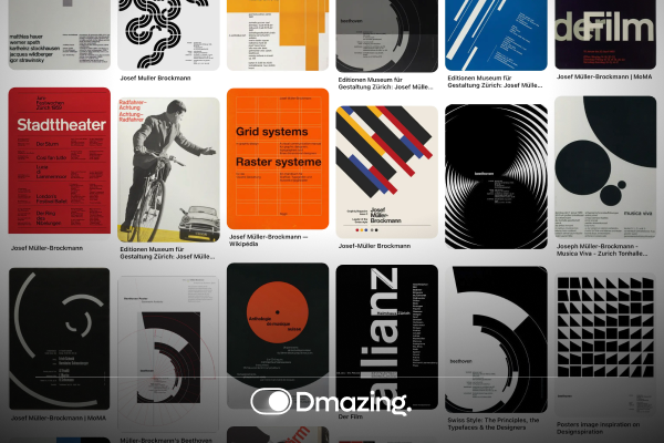
Swiss design is quickly gaining traction worldwide, and by 2025, it’s sure to be a mainstay in both print and digital spaces. Also known as the International Typographic Style, Swiss design is all about clarity, functionality, and minimalism. In this article, you’ll discover the crucial aspects of Swiss design and learn how to apply them to build stunning UIs that users will love.
“Just look how many countries use the effectiveness of Swiss design!”
From New York’s modern subway signs to sleek global app interfaces, the impact is everywhere.
1. Grid Systems: The Foundation of Organization
A solid grid is the backbone of any Swiss-inspired layout. Grids serve as invisible helpers that keep your design consistent and organized across different devices.
Why Grids Matter
• They help you arrange large chunks of content neatly.
• They improve design scalability, balance, and alignment.
• They ensure layout consistency across multiple screen sizes.
• They make your interface feel unified and natural to navigate.
By using a grid, you give your users a clear structure to follow, reducing confusion and enhancing overall usability.
2. Typography: The Craft of Effective Expression
Swiss design puts a huge emphasis on typography. It’s not just about picking a “pretty” font; it’s about readability, hierarchy, and emotional impact.
1. Know Your Audience
• Which industry are you designing for?
• Who are your ideal users?
• What feelings do you want to evoke?
2. Choose Wisely
• Serif fonts can feel luxurious and established.
• Sans-serif fonts often feel modern and straightforward.
• Always test your chosen typefaces in different browsers (and on various devices) to avoid style glitches.
3. Size and Hierarchy
• Use tools like TypeScale to generate balanced font sizes.
• Keep headings, subheadings, and body text consistent so users can scan your site easily.
Takeaway: Good typography is more than a pretty font—it’s about clear communication that helps users absorb content quickly.
3. Keep Things Simple
At its core, Swiss design prizes simplicity. That means stripping away anything that doesn’t serve a purpose. Focus on clear layouts, easy navigation, and a smooth user experience.
Minimalism Matters
• Remove non-essential elements that clutter your interface.
• Maintain pixel-perfect spacing and consistent alignment.
• Subtle animations can add a nice touch—but if they distract, lose them.
Takeaway: By embracing the “less is more” philosophy, you highlight what really matters, boosting both usability and user satisfaction.
4. Contrast and Clarity: Drawing the Eye
Swiss design thrives on contrast to emphasize key elements. Through strategic use of color, white space, and hierarchy, you can make sure your user’s eye goes right where you want it to.
Use Color Wisely
• Check contrast against WCAG standards for accessibility.
• Reserve bold or bright colors for calls to action or critical features.
White Space
• Give each element room to breathe, preventing visual overload.
• Guide users naturally through your layout with spacing instead of arrows or clutter.
Clear Hierarchy
• Let users see at a glance which content or action is most important.
• Strong contrasts and consistent spacing keep everything logical.
Takeaway: Effective contrast and clarity help your design communicate quickly, guiding your users to the next step without confusion.

Why Swiss Design Endures
Swiss design has proven itself timeless by marrying functionality with minimalism. It’s a style that emphasizes the user’s needs above all else, which is why it remains so influential—across cultures, industries, and eras. Stick to clarity, precision, and balance, and you’ll craft interfaces that look great and work even better.
Ready to Elevate Your UI With Swiss Design?
If you’re eager to see how Swiss design can refine your next project, Dmazing Studio is here to help. We’ve got over 11 years of experience blending minimalism and functionality to create UIs that stand out and convert.
Book your FREE 30-minute consultation to learn how we can apply Swiss design principles to your product—making it cleaner, more intuitive, and undeniably effective:
https://calendly.com/dmazing-studio/30min
Let’s make “less” do so much more for you and your users—together!


